Sentry Scouts: UX — A Recap
Sentry Scouts: UX — A RecapSentry Scouts Meetups are organized by software developers for software developers, about the future of building and using software. Sign up for the next Sentry Scouts Meetup or enjoy a video of a past Meetup.
Or do both. Or do neither. Or simply become paralyzed by choice and take a nap.
Have you ever approached a door and been unsure whether you should push or pull? Maybe you bypass that uncertainty and push the door open with confidence, only to be met with hesitancy — both from the door and from everyone around you who is now trying to avoid eye contact. You, my friend, have encountered a Normal Door. In other words, a door that is giving off the wrong usability signals (like having handles on both sides). As you know now that you’re finally inside (or outside), Norman Doors do not provide a good UX, or User Experience — the topic of our third Sentry Scouts Meetup.
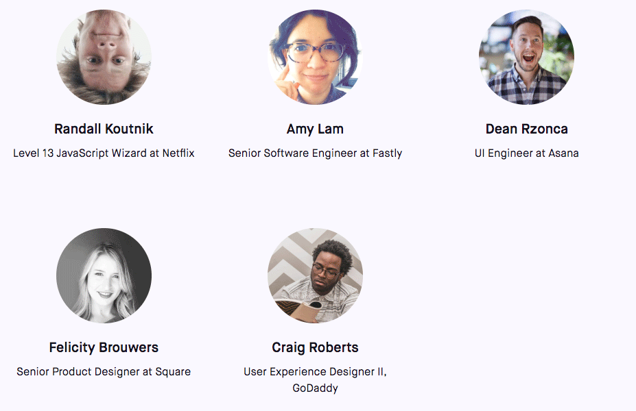
Sentry Scouts are an opportunity for like-minded friends and professionals to swap stories around a campfire. Don’t worry; the campfire is merely orange paper and won’t burn you (probably). This month, we gathered a group of esteemed panelists:
From our example above, we know that Norman Doors have a poor UX. We also know that UX is short for User Experience. But do we know what User Experience is, what it means? Our panelists certainly do, and soon you will too. (Or, maybe you already do. In any case, you came here for a recap, and a recap you shall receive. Please proceed.)
Delightful experience is the end goal.
Great landing, wrong airport.
“UX is simply creating [a] strategy to solve a problem using a particular medium with research behind it,” according to Craig Roberts of GoDaddy. Expanding on this idea, Randall Koutnik of Nexflix gives us a great visual: “great landing, wrong airport.” Working on UX requires an element of strategic planning, especially when considering the direction of the product design.
Teams that work on UX are often reactionary, as Felicity Brouwers of Square describes, designing for internal teams without much consideration for external customers. The challenge, as Koutnik sees it, is ensuring a product solves a legitimate problem experienced by end-users.
A/B tests aren’t enough.
Amy Lam of Fastly adds that UX professionals should be “making complicated things easier for the user and helping them along the way, [whether that be with] error messages or preventing them from doing something dangerous.” She goes on to emphasize that a “delightful experience is the end goal.” Again, User Experience is about the user, which isn’t always as obvious as it should be, considering these two words both depict and define the concept.
UX is a process: collaborative and defined.
Once a company has identified a problem or need, the design process can begin. However, UX designers and engineers don’t create products in a vacuum. Brouwers interprets her team’s strategy as “deciding what those problems and opportunities are. Talk[ing] to users constantly — a couple of user interviews every week.” From an engineering standpoint, Dean Rzonca of Asana says his role is “to help make sure something will be technically feasible and then help carry it through the design process.”
Lam explains that the process is collaborative and cross-functional — one that draws on engineering, product, designers, customer support, and even customers themselves. “In general we want to deliver a positive experience and have our customers be happy.” But how can customer happiness be measured?
Some of our panelists explicitly define success metrics so that their teams have a sense of direction. “A/B tests aren’t enough,” says Brouwers. “Pair [A/B tests] with user testing and other things like the initial design, aligning on the scope, user testing, design development, testing, slow release or beta, and ship the final design.”
It’s our responsibility to get the kind of feedback we need.
Numbers don’t tell the whole story.
Many UX designers and engineers balance the quantitative A/B test results with qualitative feedback, sourced both internally and externally. “You don’t have to be a chef to know food tastes bad,” explains Roberts. “Everybody has eyes, and they are identifying a problem. They might not have as much context, but their input is valuable.” Rzonca adds that “it’s our responsibility to get the kind of feedback we need.”
It’s also worth noting that there may be a tipping point when it comes to feedback. While Lam believes that all input is critical, having a set of design principles or goals in mind will also prove valuable. Brouwers offered an example of Square’s guiding principle: economic empowerment. Her team views all feedback and decisions through this lens, asking themselves how everything impacts the customer and their ability to thrive financially.
Ultimately, UX professionals need to think strategically, set clear goals for their team, and sort through feedback to uncover the most compelling narrative. That is, unless they want to end up with a mess that results in — you guessed it — a poor UX (aka, a Norman Door).
Thank you to everyone who joined us for Sentry Scouts: UX. We hope to see you next time. In the meantime, you’ll want to check out our fantastic blog, educational (yet fun) tutorials, and other helpful resources.
See you there! Or here, on the internet!


