Sentry emails get a facelift
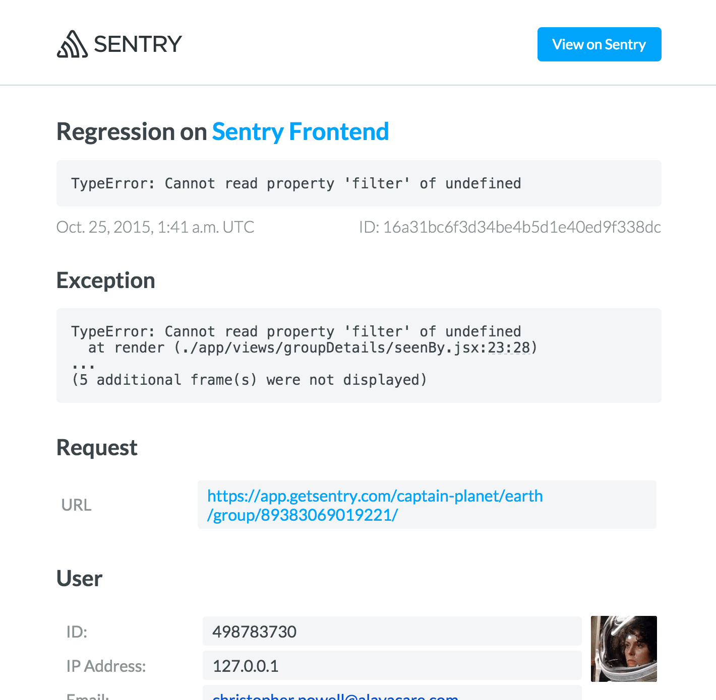
Sentry emails get a faceliftLast week we pushed an update to our notification emails. In addition to overhauling the visual design and addressing various legibility issues, we've restructured the emails by putting the most important error monitoring bits front and center. They also look much better on mobile.
Here's a brief look at some of the progress we've made so far.
New Event

In the New Event email, we've shifted the stack trace and exception towards the beginning, while moving tags near the end.
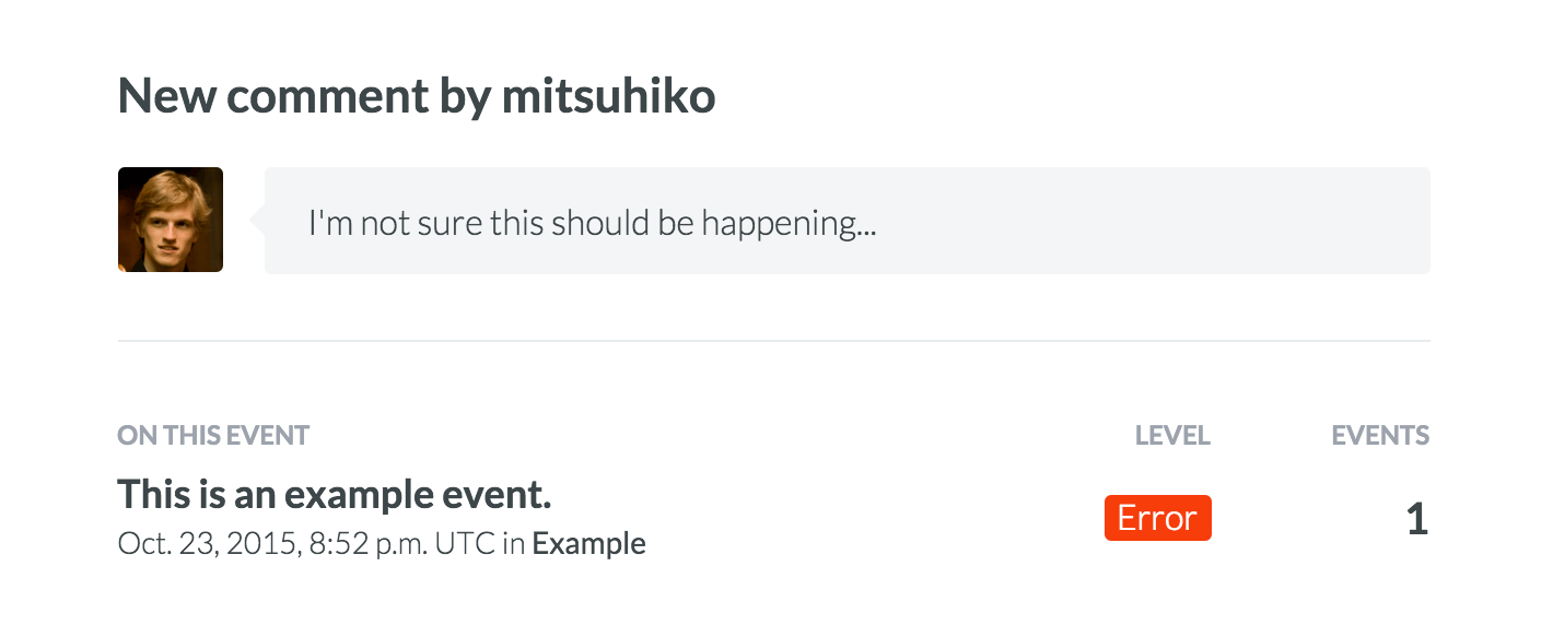
Issue Comment

Comments on issues now have a face to go with them. We also flipped the order of the content so that the activity (in this case, a comment) comes first.
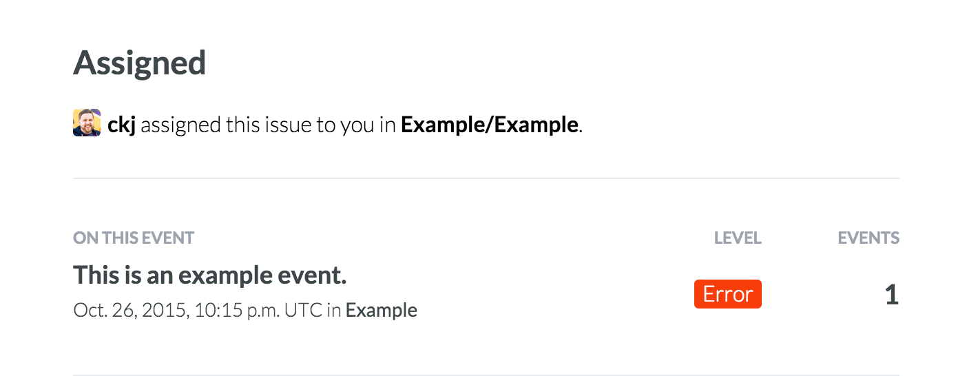
Assignment

Similarly, now you can see who's assigning you to events.
These changes lay the groundwork for some bigger ideas we're working on. Stay tuned!


