Choosing the Right Metric: A Guide to Percentiles and Averages
Choosing the Right Metric: A Guide to Percentiles and Averages
Not sure which performance metric to use to measure your application performance? Don't worry – you're not alone. With a wide variety of options, the task of choosing the right metric can be daunting. This post will help you decide which metric is right for your monitoring needs by discussing the strengths and limitations of each metric.
Why choosing the right metric matters
Choosing the appropriate metric for performance monitoring is like picking the right tool for a task. Just as using a wrench to hammer a nail won’t yield the best results, using the wrong metric to monitor performance can lead to misleading insights. Without a complete picture of your app performance, you risk poor user satisfaction, missed optimization opportunities, and longer resolution time for issues.
For instance, if you rely solely on an average metric to assess your application's performance, you might overlook occasional spikes or dips that could significantly affect user experience. Conversely, using a percentile like p99 can help you identify those rare yet impactful performance issues that might otherwise slip under the radar.
Averages: the simple overview
Averages are a straightforward metric for performance monitoring. They provide a simple snapshot of overall performance by summing up all the data points, then dividing by the total number of data points. This metric is easy to understand and calculate, making it a tempting choice.
However, averages only work well and reflect typical experiences when data is relatively consistent (i.e. without large outliers or skewness). Averages can also be effective for assessing server saturation and capacity — for example, moving averages signal that the overall system is becoming overwhelmed. However, for other use cases, averages have limitations.
The pitfall of averages
Averages can be misleading when the data is not uniform. When monitoring page load times, averages may not be helpful because there can be many outliers making your signal noisy. User devices are subject to all sorts of volatile characteristics, like network, well outside your app's control that contribute to this noise. This is where percentiles come into play.
Percentiles: understanding variability
Percentiles offer a more nuanced view of performance by dividing data into segments based on their distribution, which reveals how well the system is performing across different scenarios. In theory, you can monitor any percentile but in practice, only these five are used — p50, p75, p95, p99, and p100 — with p75 and p95 being the most popular choices.
p50 (Median): This is the value below which 50% of the data falls. The p50 gives insight into central data tendencies and typical performance. Rise or fall in p50 indicates changes in median performance, reflecting faster or slower response times across data points.
p75: 75% of the data falls below this value. p75 is a valuable metric for frontend applications due to wide variability in user conditions, which results in a less predictable distribution of data. p75 strikes a balance between central performance trends and the wide range of user experiences encountered on the frontend.
p95: This is the threshold below which 95% of the data falls. p95 is valuable for backend applications with uniform data, capturing the performance expected by most users and highlighting bottlenecks. However, in variable frontend settings, p95 signifies the worst-case scenario and isn’t representative of a typical user experience.
p99: Only 1% of the data surpasses this value. In scenarios with high data consistency, like for backend applications, p99 marks the upper limit of performance, highlighting the most extreme cases.
p100 (Maximum): This is the highest observed value and is rarely used. p100 may be valuable for identifying sources of noise in frontend applications, like instrumentation problems or client-side variables. In backend applications, it can signify true noise or occasionally extreme outliers.
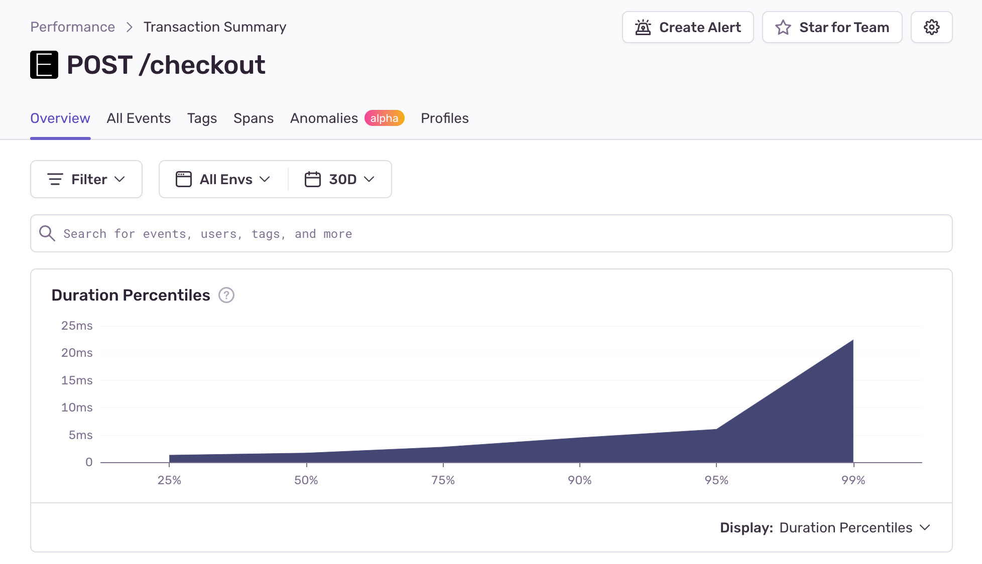
Here’s an example of percentiles for a backend transaction below. You’re observing a typical pattern: a gradual rise from p25 to p75, followed by a steeper yet still gradual climb from p75 to p95. Finally, there’s a sudden sharp spike up to p99. Interestingly, p100 is absent from the graph since it would compress the other percentile details into a flat line (due to increased scale of the y-axis) and distort the visualization.
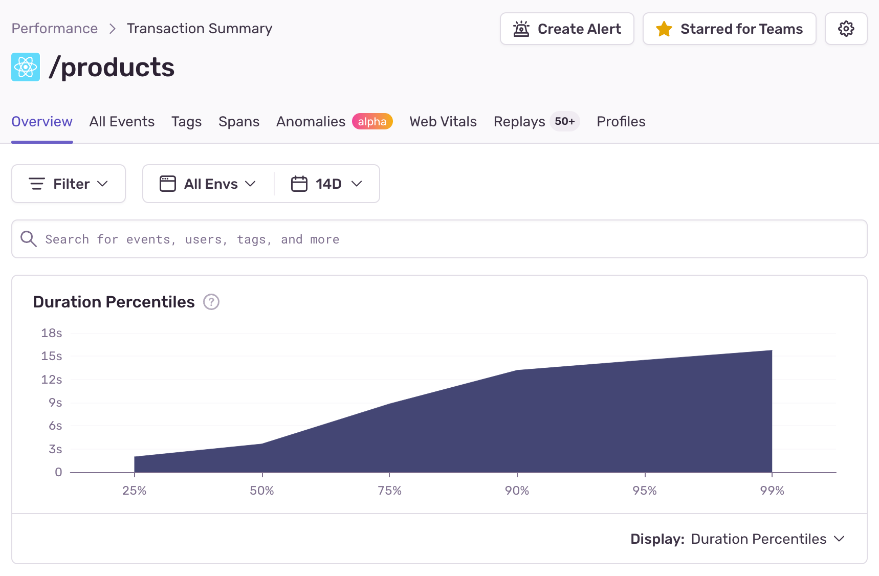
Here’s another example of a percentile chart typical for frontend applications. In this scenario, you can see a gradual rise from p25 to p50, indicating a moderate increase in duration. Following that, there’s a steeper climb from p50 to p90, signifying a more rapid increase in values.
Choosing the best metric: striking a balance
What metrics you choose to monitor should align with your application performance objectives and depends on how much variability is in your data. Let's break down the options to help you make an informed choice:
User experience perspective: If your primary concern is understanding how the majority of users interact with your system, focus on percentiles like p75 or p95. These metrics offer holistic views of typical performance.
Choosing whether to track p75s or p95s depends on the type of application you want to monitor. For environments with high variability, like frontend applications, opting for p75 is recommended. In situations with greater data consistency, such as backend applications, p95 may be more suitable.
Detecting anomalies: When it’s vital to pinpoint outliers and rare occurrences impacting a small user subset, opt for p95 (for frontend apps) or p99 (for backend apps). These percentiles help identify issues that may not be caught when using average-centric metrics.
Planning for scalability: If your goal is to plan for resource allocation and system scalability, averages are valuable. By monitoring averages during periods of increased load, you can pinpoint when your system is reaching its capacity limits.
Resolve issues faster with Sentry Performance Monitoring
Both averages and percentiles are critical metrics for performance monitoring. While averages provide a broad overview, percentiles offer a detailed understanding of variability and outliers. The best approach depends on your monitoring objectives and the specific conditions you’re dealing with.
To effectively monitor performance, consider using percentiles like p75 and p95 to capture the majority of user experiences, while also keeping an eye on p99s to address extreme scenarios. By carefully selecting and interpreting these metrics, you'll gain a comprehensive insight into your system's performance, ensuring a smoother user experience and faster issue resolution.
To start capturing performance data immediately, all you need to do is set up performance monitoring (which takes just 5 lines of code). If you’re new to Sentry, you can try it for free or request a demo to get started.
To learn more about application performance monitoring, here are some resources:


